

Three weeks ago, I wrote a post linking to a dashboard that tracks the Tour de France's overall standings, featuring the new Supermetrics bump chart. Now that the tour is over, we can see how riders have moved up and down the overall standings.
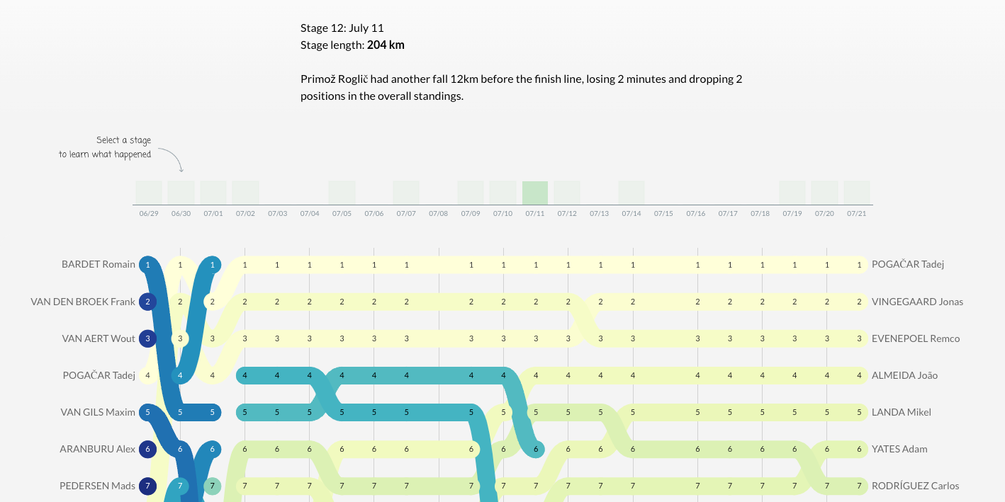
The interesting question in dashboarding is what we can see in a chart and what contextual information we need to add in the form of annotations. During the past three weeks, I have been taking notes about what happened at each stage as long as it impacted the chart. Then, I looked for an efficient way to add these annotations to the dashboard.
After evaluating several alternatives, I slightly misused an interactive bar chart and combined it with our Tell Me chart. Report viewers can now click the little green squares to read some contextual information explaining the chart's events.
At Supermetrics, we may not focus much on the Tour de France, but the same principle can be applied to tracking ad campaigns. Changes don't just happen for no reason. While we can see patterns of change in charts, we often miss why these changes occurred. Adding contextual information can be the key to success for your next dashboard.
The dashboard
You can still view the dashboard in Looker Studio, and don't miss the view with all the riders:
If you want early access to the bump chart or the newest version of Tell Me through our beta tester program, please join the private Supermetrics Charts group.
These new charts are still part of a closed beta test with the Looker Studio team, and you'll need to get whitelisted by the Looker team to use them. You'll find all the necessary information in this group's pinned post.