

While you might still be watching the Euro, another big sports event has started: the Tour de France, which began last Saturday.
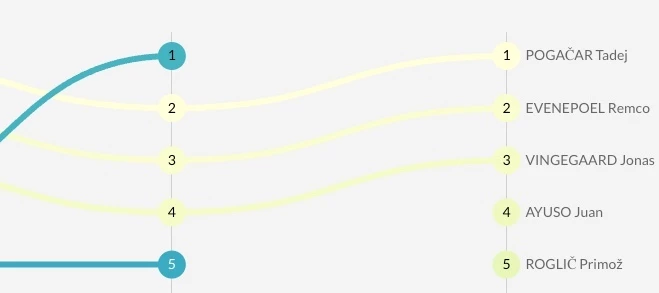
Using a bump chart, I created a small dashboard to show the current standings. This type of chart makes it easy to see rankings over time without the clutter of a line chart.
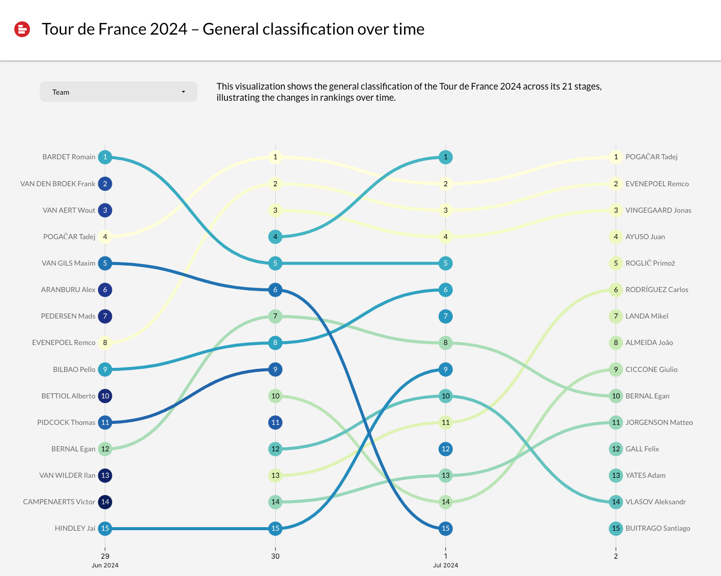
The bump chart is part of a new series of Supermetrics Charts we're testing. Soon, you'll be able to track your top campaigns just like you can track the top riders over the next three weeks.
If you want early access to this visualization through our beta tester program, please join the private Supermetrics Charts group.
Behind the scenes
The data structure behind this visualization is quite simple: The daily overall standings are collected in a Google Sheet containing a list of all riders and 21 stages. To combine all results into one table, I asked ChatGPT to create a little Apps Script (!) While the script isn't very performing, it does the job and keeps the Sheet clean.
Designing the report was easy; we're now using our Looker Studio Toolkit as a base design. Another topic I'll be talking about very soon.
