When did you last open a Looker Studio report on your smartphone? Probably not recently—it's no secret that these reports don't display well on mobile devices.
That could change in 2025, as the Looker Studio team is working on a new feature: responsive grids designed to make reports look great on all devices. This feature is currently in private preview, so you must sign up as a tester to try it out.
If you don't have the time or patience for beta testing, we share our initial impressions of responsive reports.
First look at responsive reports
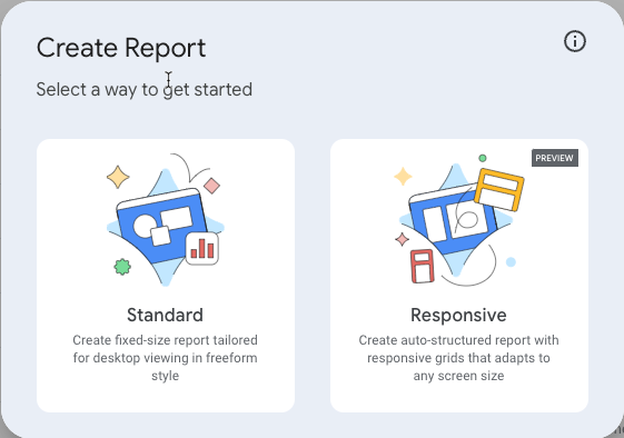
You'll need to create a new report to get started—existing reports can't be converted to the new format. If you can access the feature, you'll see a new screen that lets you choose between standard and responsive reports.

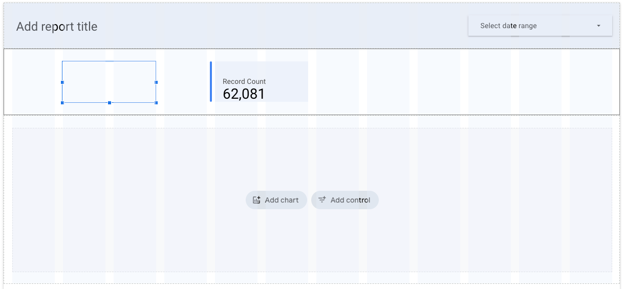
After selecting the "Responsive" option, the interface will look familiar. But once you drag charts onto the canvas, you'll notice the new 12-column grid layout. This layout is enforced, meaning you can only position charts within the grid. It's similar to how most responsive websites are built today.

To add more charts, you can create sections. The vertical space of your report adjusts dynamically based on the number of charts you add, which is a significant improvement over standard reports.
However, this initial version comes with some limitations. For example, you can't overlay elements or vertically align them. Each chart or graphic is placed in its section, one on top of the other. This can make certain designs, such as headers, more challenging. That said, we expect these limitations will be addressed in future updates.
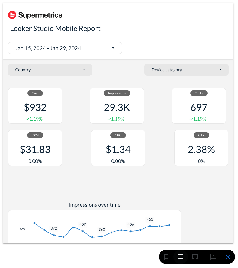
Despite these restrictions, the simplicity is refreshing. You can also use the new mobile preview button to see how your report looks on smartphones and tablets.

Not perfect … Yet
There's still room for improvement before the feature is broadly released. While the alignment of elements on smaller devices is better than in standard reports, it could be better.
For example, single charts on a row should span the full width of the screen on mobile, but currently, they don’t. On larger screens, visualizations are scaled up, often appearing oversized. This also causes community visualizations to look stretched and blurry.
The mobile header design could also use some work, as navigating between pages is currently a bit clunky.
You can view a small dummy report we set up here:
You might notice that maps don't always work well on mobile and that the report can only be viewed in Chrome.
A Promising Improvement
This is shaping up to be one of the most exciting updates in Looker Studio. We'll share more updates here as the feature evolves.
If you'd like to enable this feature for yourself, you can sign up for access and wait to be approved.


