

I was recently asked if it's possible to use Tell Me to gain insight into how certain dimension values compare to the dataset's average.
Getting the data right is less a chart problem, but a typical "Level of Detail" or "LOD" case. From my designer perspective, it's one of the hardest things to understand. It took me many hours to learn how to do this in Tableau, and I wondered if it could also be achieved natively in Looker Studio without using BigQuery.
The short answer is yes, it's possible. Let's look at the following result:
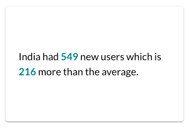
How can row-level data be compared with aggregated values of the dataset?
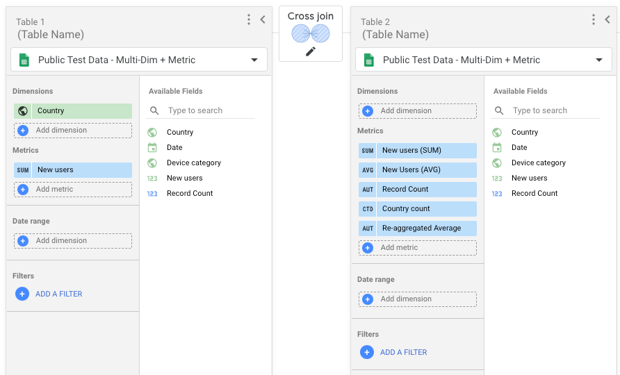
The solution isn't trivial, and we need to use a Looker Studio technique called "self-join."
A self-join is a data blend where both datasets have the same source. To achieve the desired outcome, we need to create a cross-join, which doesn't require any join conditions.
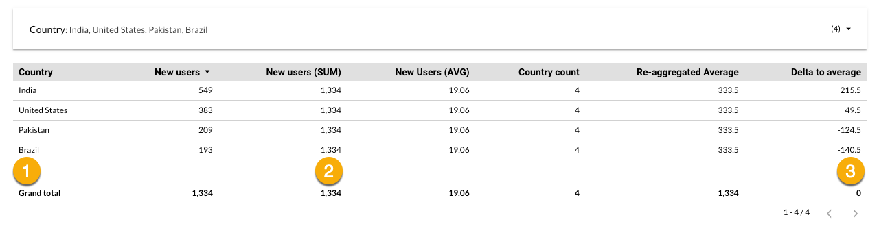
Now, we have all our metrics in a simple table and can use that with Tell Me to create simple insights or more elaborate lists. The example above can be achieved with Tell Me Light, a free community visualization in Looker Studio.
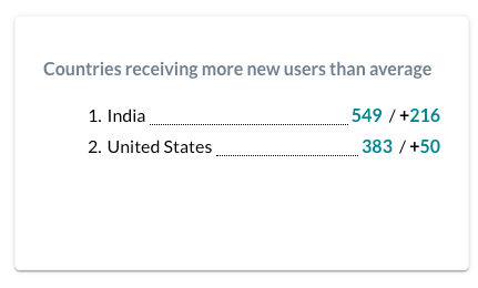
The variations from here are almost endless. For example, list all dimension values that perform above the average.
What other use cases do you see applying this technique? Please add your thoughts in the comments below.