

Choosing the right typeface for reports in Looker Studio isn't very difficult. Only a few fonts available can be used to display numbers in tables: Lato, Roboto, and Open Sans.
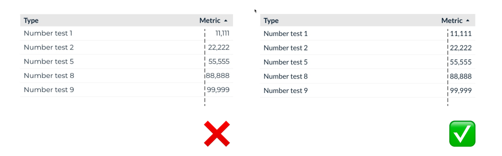
All three typefaces have a few things in common: they're highly readable sans-serif fonts, even in small sizes. Most importantly, their numbers are monospaced, meaning all numbers will vertically align perfectly in a table.
We chose Lato over Roboto and Open Sans because "Lato" is the Polish word for "summer". We all love summer at Supermetrics.
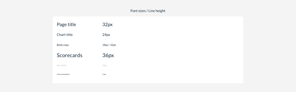
To ensure consistent usage of font faces and sizes, we recommend creating a page that lists the different headlines, sub-headlines, and labels or axes in your reports. In Looker Studio, you can also determine the line height. You may use a custom value for bigger text blocks to create a more airy look.
Of course, you can also be creative with different fonts. We like to use "Indie Flower" to create hand-style type annotations in some of our visualization guides.
What font combinations are you using in your reports?