

Now and then, Looker Studio sneaks in a new feature before updating the official release notes. The same happened yesterday when a new feature suddenly popped up when one tried to create a new calculated field: "Add bin."
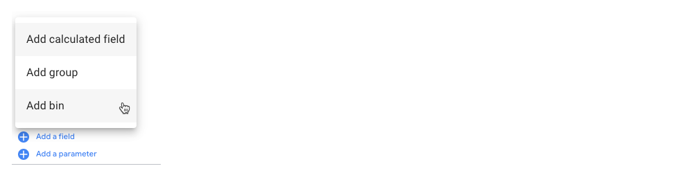
If you click this new option in the drop-down menu, you'll see a new interface for easily creating bins.
What are bins?
Bins in data visualization are like containers that group similar data points, helping to show how data is distributed in a chart, such as a histogram.
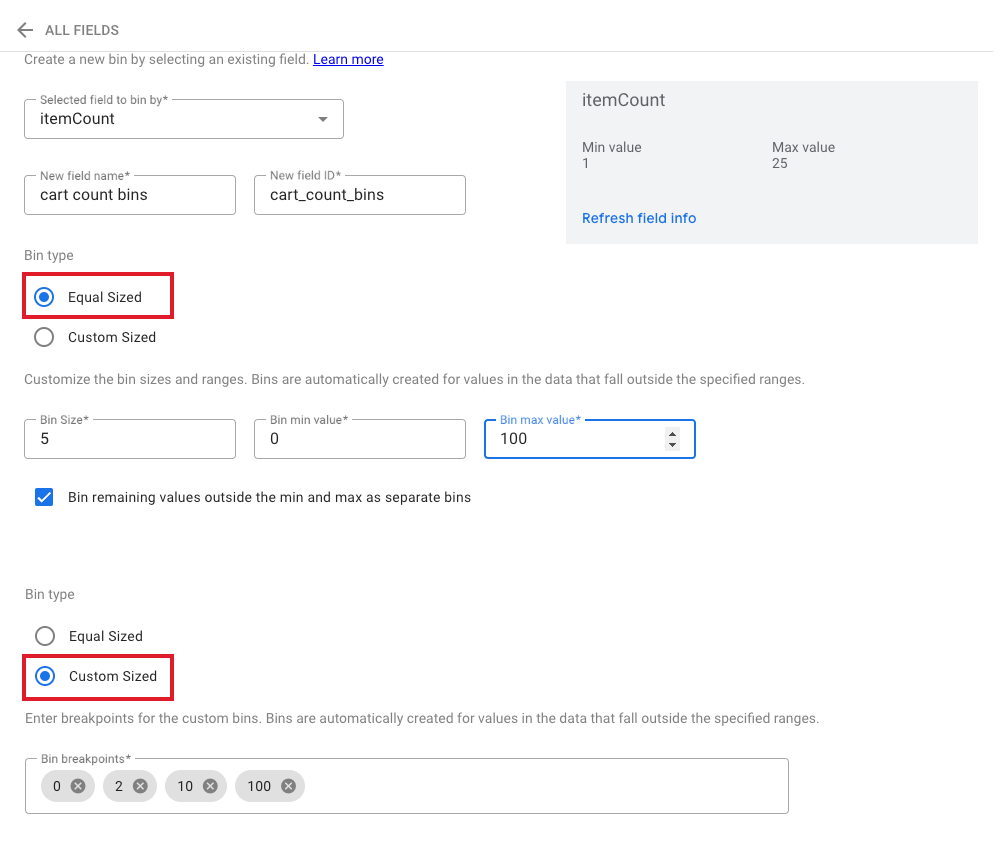
To create a real-life example, I asked ChatGPT to create a small dataset containing 150 shopping carts with the number of items each cart includes.
To visualize such a dataset, you would use a histogram. But before, you would need to "categorize" these numbers. We'd have used CASE statements within a calculated field for this task. Now, we can use a graphical interface.
There are two options to create the bins: Equal-sized or custom-sized.
Once you have created your bins, drop the new calculated field into a bar chart to see the result of the previous operation.
The first chart shows equal-sized bins. How many carts contain 0-5 items, how many carts contain 6-10 items, etc. The second chart uses custom-sized bins: 0-2, 3-10, and 11-100.
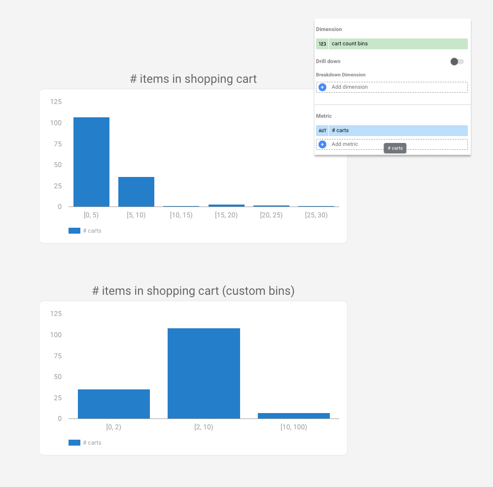
And as you can see, most shopping carts contain more than 2 items in our dataset.
What can you build with this new functionality?