

When starting a new Looker Studio dashboard, one of the first things you need to decide on are the foundational elements: layout, grid, and headers. Here's a quick roundup of what to watch out for.
Canvas size & navigation
For the navigation, there are two crucial decisions to make:
- Where do you want to place your navigation?
- How wide should your report be?
It's always easier to create reports on a larger canvas. But will it fit into your users' screens? If you prefer your navigation on the side because you expect your reports to have many pages, the navigation will further reduce the horizontal space available.
If you place your navigation on top, your reports can be wider, but you'll fit fewer pages unless you store pages within sections. Sections in Looker Studio are like folders and are a great way to organize dashboards with many reporting pages.
We are using the top navigation with a canvas width of 1420px. However, we also considered the side navigation with a canvas of 1180px. Both combinations will fit in most laptops without horizontal scrolling.
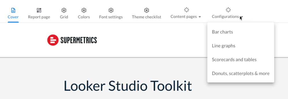
Also, using icons will help the reader to scan the navigation faster.
Grid
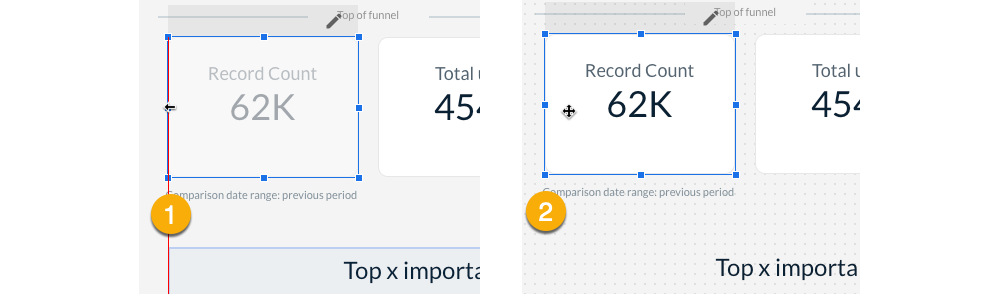
To align elements in edit mode, you have the choice between using “smart guides” or the page “grid”. We find that using a grid, with a small grid size of 10 pixels, is easier to manipulate than the smart guides. The page grid lets you conveniently place items with your keyboard, ensuring things are well-aligned.
This is a personal preference, and you may want to experiment with the smart guides as well. You can always switch between the two methods.
Header, footer, and report-wide elements
Once you have decided where your navigation sits, it's time to decide the look and feel of the header elements. The header of a data report usually contains the organization’s logo, the report title, maybe an important link to documentation, and sometimes a date picker. Our advice is to keep the header as light as possible.
To ensure the headlines are always in the same spot and don’t shift, we split the report title into two parts. The first part defines the name of the report and is set as a report-wide element. The second part contains the page title and is a page element. Because the report name is a report-wide element, you'll immediately notice if your page title is misplaced.
Set as many elements as possible to report-wide, as your assets are easier to maintain. If there is a single page where this element isn’t used, you can sometimes hide it with a shape element.

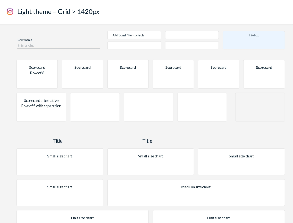
Creating a dashboard layout
With the global elements fixed, let’s continue with the dashboard layout. The layout answers multiple questions:
- What size should scorecards be?
- How big are charts, and how many charts should you place on a single page?
- What is the distance between the header, filters, scorecards, or charts?
A great way of defining and documenting a layout is to create a page with simple boxes. Create a flexible layout by defining the sizes and spacing of all your dashboard elements, like scorecards, charts, labels, etc. These blocks can later be used on a report page to easily align dashboard elements and ensure coherence across your pages.
How does your preferred dashboard layout llok like? Do you let readers change the time frame? How many filters do you add in general into dashboards and where do you place them? Show us your examples in the comments below.