
Sure, marketing data is important — but how you present your data is what makes it shine! ✨

Whether you’re presenting data to internal stakeholders, analyzing it to aid decision-making, or even communicating data to your customers — what’s important is presenting it in a manner that’s easy to digest and understand.

Here’s a roundup of our best data visualization resources to help you really tell the story of your data!


📖 Read: ‘How to build an ecommerce dashboard in Google Data Studio’.  


📖 Read: ‘Data visualization for marketers: 6 steps to present data visually’.  


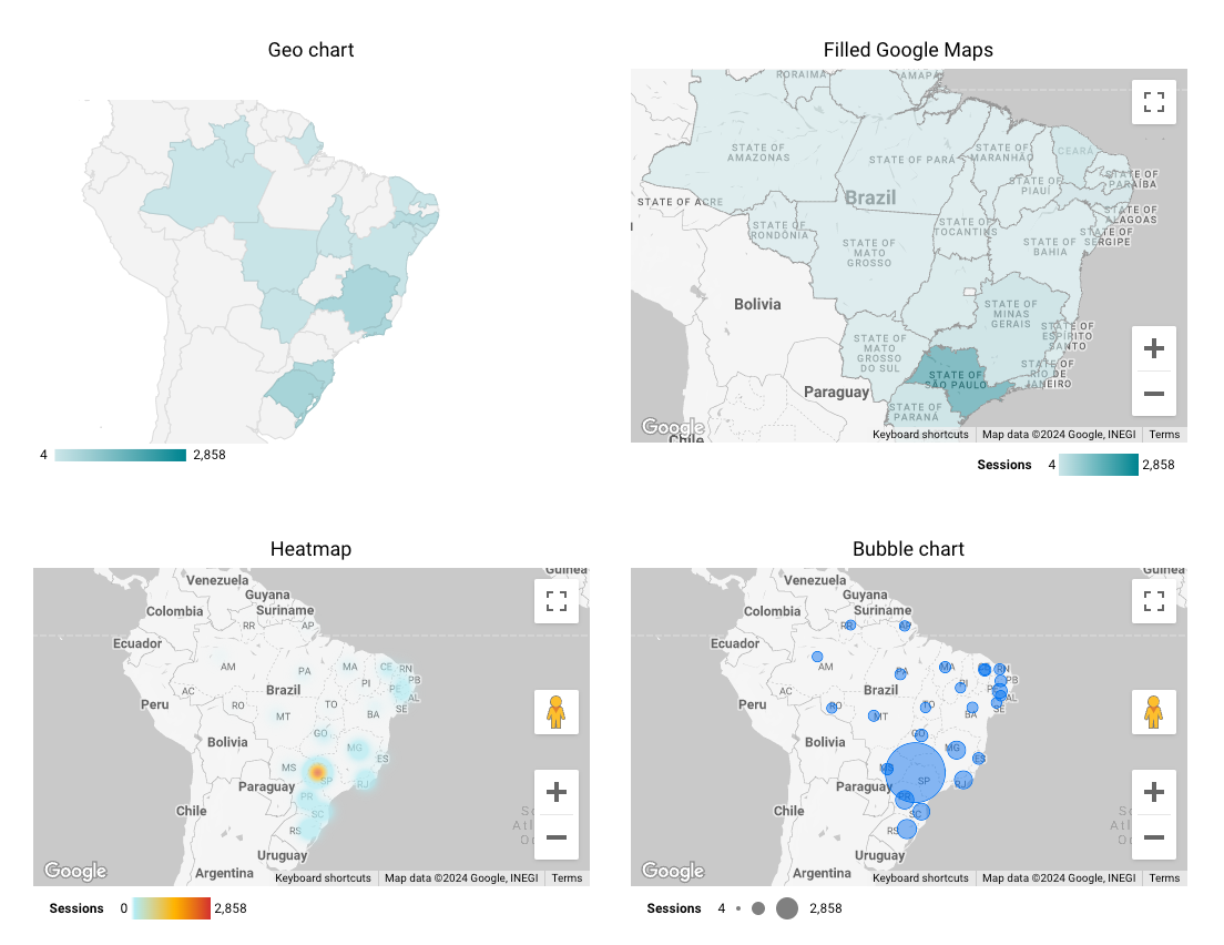
📹 Watch: ‘Data visualization in Looker Studio: Better dashboards with Supermetrics Charts’:


What do you think of visualizing data this way? Do you think we can improve something?
Thank you for sharing your knowledge!


Hi Sandrinha,

First of all, thanks for participating in our community. I hope this will become a great place to share all our knowledge.

I have been looking at your screenshots, and I think I can give you some tips on how to improve them. But keep in mind that there are many other options on how to design dashboards, and these are my personal recommendations.

Before starting to create dashboards, I always ask two questions:

  1. What should the report viewer learn from the dashboard?
  2. What do I expect them to do with this knowledge (what action should they take, based on what they just learned)?

Assuming the following:

  • The viewer must understand in which state our ads get the most views and gather the most engagements.
  • The viewer should adjust regional ad budgets based on the presented data.

From here, I usually try to focus on these two points and remove all the clutter that isn’t directly helping to answer these questions. Our goal is to answer the questions quickly (more than precisely).

You have been using two chart types to present the same data. This is great. I even encourage you to use more types for the same data sometimes, as each chart type can reveal slightly different insights that might better answer certain angles.

***

Tables I use tables as the last option for dashboards. We can’t avoid them completely, and some viewers even request them.

Why do I avoid tables? If we present tables to viewers, we ask them to do the work we (as dashboard designers) should have done: reveal insights efficiently.

Here are two tips to make tables more accessible:

  • Use compact numbers.
  • Use heatmaps to help a viewer read the numbers faster.

Looker Studio also offers bars that can be used to give visual clues for the metrics.

In this screenshot, we can see that Sao Paulo clearly has the most views, and the state of Maranhao has a poor engagement rate.


An alternative for the table might be a horizontal stacked bar chart.

***

Maps There are many maps available in Looker Studio:

  • Geo Chart
  • Filled Maps
  • Heat Maps
  • Bubble Chart
4 maps in Looker Studio showing the same data

Why would I use one over the other?

Geo Chart I think this is an older chart, but I like that the map is very reduced and not grabbing too much attention. But I can also see that it has issues rendering the State of Sao Paulo.

Filled Maps Similar to Geo Chart, but the map makes it a bit more cluttered. Still, it’s a great way to visualize this type of data. Also note, that I chose the sliver map type, what makes the data stand out over the map.

The downside of filled maps is that states with a large area can grab all your attention even if they have a small population. There is actually a great blog post about this topic.

An alternative for filled maps are tile grid maps.

Heat Maps Heat maps are one of my favorites, as they show “hot spots” of your data. They work, however, better when the data is more granular, i.e., by city or with the exact geo-location.

Bubble Chart Bubble charts are also a great choice, but I would use only a single color for all bubbles. There isn’t any additional information in the additional color coding. It’s also a good choice to make the bubbles transparent to better see overlapping bubbles.

As with heat maps, bubble charts work better with more granular data but are as good as filled maps in your use case.

***

UI Colors One last note about colors: You’re making quite some use of red in your dashboard. I assume red is your corporate color.

However, red grabs a lot of attention, especially as we all interpret the color red as a “danger zone.” I would consider replacing the red here with a more neutral color, perhaps a warm grey that still fits well with your corporate colors.


Hope these tips help you to fine-tune your dashboard.

Cheers!

ralph


Dear Ralph,

I would like to express my sincere gratitude for the valuable tips you provided. Your insights were extremely helpful, and I will definitely apply this knowledge in future analyses.


Your final tip about the use of colors was also very pertinent. The use of red in my dashboard, even as a corporate color, can indeed divert attention from the data. I will consider using a more neutral color, such as a warm grey, to maintain visual harmony without compromising data clarity.

Thank you again for your time and assistance. Your suggestions will be invaluable in refining and enhancing my future dashboards.

Best regards,
Sandrinha


Hi Sandrinha,

I’m very glad these tips have been helpful. Keep coming back with more topics!

ralph


Reply