

Choosing the right colors for your reports might be the most challenging part of setting up your Looker Studio dashboard. This article gives a basic guide through the color jungle of data visualization.
In data visualization, we differentiate between three categories of colors:
- UI colors
- Categorical colors
- Diverging colors
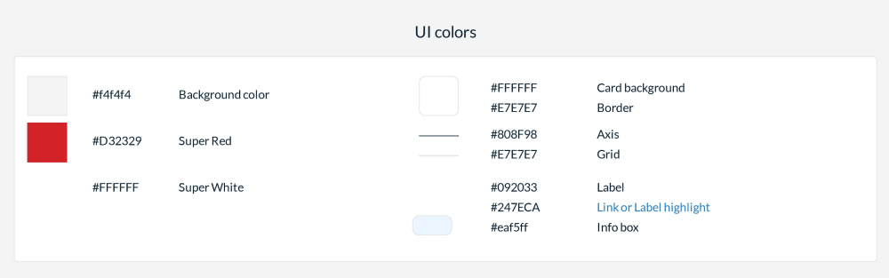
UI colors
The user interface colors define all elements that don't have a direct relationship with the data. They include your corporate colors for logos or headlines, boxes or layout elements, and colors for labels, annotations, and axes. We suggest keeping these colors as subtle as possible, giving more room for your report's visualizations.
Categorical colors
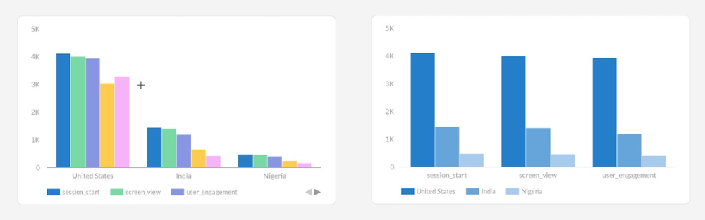
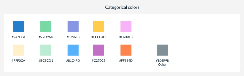
These are the colors you want to use for your charts. The first color is the most important because it will be used in almost all charts. Often, you'll use bar charts with a single color or line charts with a single color. All other colors will be used when you use a dimension in a chart, such as pie charts, stacked or grouped bar charts, etc.
The first five colors will be used most often. It's recommended to use at most 5-7 colors in a single chart, as a reader may have difficulty differentiating more than that. Most categorical color schemes come with ten colors, and Looker Studio offers room to set 20 colors in the theme settings.
Once you have created your color palette, go into your theme settings and apply these colors to the chart palette. This will ensure your preferred colors are used automatically in all charts you create in your report. You can also manage dimension colors in the theme settings. Dimension colors are created automatically when you create a chart. For example, if you create a pie chart with the dimension "devices," Looker Studio will create a color entry for each device value in your dataset.
Ensure these colors are defined beforehand if you have values used throughout your reports. Sometimes, you want specific values to use specific colors, like "Facebook" always being blue and "YouTube" always being red.
Defining categorical colors
If you want to define your categorical colors, I recommend some useful articles that describe in detail how to do it:
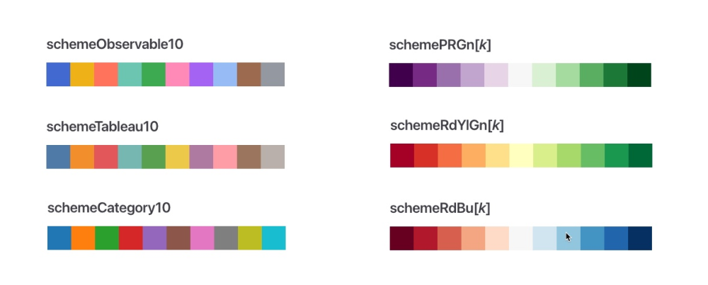
You can use a color palette creator to set the first 5 color values or pick a color palette created by professionals and used in many reports. D3, a data visualization library, includes the most used color schemes. You can copy the palette that best fits your needs.
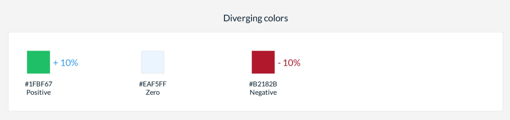
Diverging colors
Diverging colors are used to display negative and positive values in your visualizations. Diverging colors contain exactly three colors:
- Color for negative values
- Color for zero
- Color for positive values
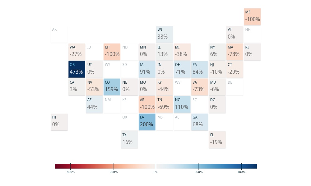
In Looker Studio, they're usually used in scorecards for positive and negative trend styles. The color for zero is used when creating heatmaps for datasets that contain negative and positive values. While Looker Studio has no visualizations that take advantage of divergent color palettes, Supermetrics Charts use them to separate positive from negative values, as seen in the tile grid map or our bullet graphs.
Choosing the right colors can significantly affect the clarity and impact of your data visualizations. How do you select your color schemes for Looker Studio dashboards? Share your tips and favorite palettes in the comments below.